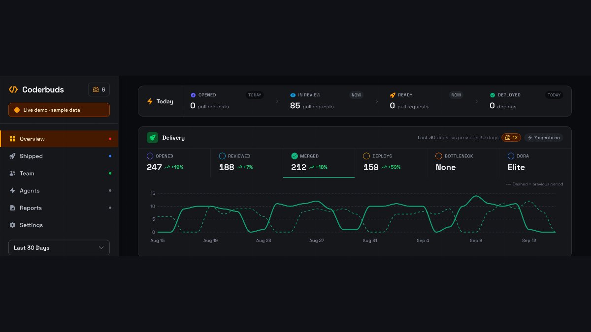
Coderbuds has a dark mode. It's in the account menu — Light, Dark, or System — and it covers the whole dashboard.
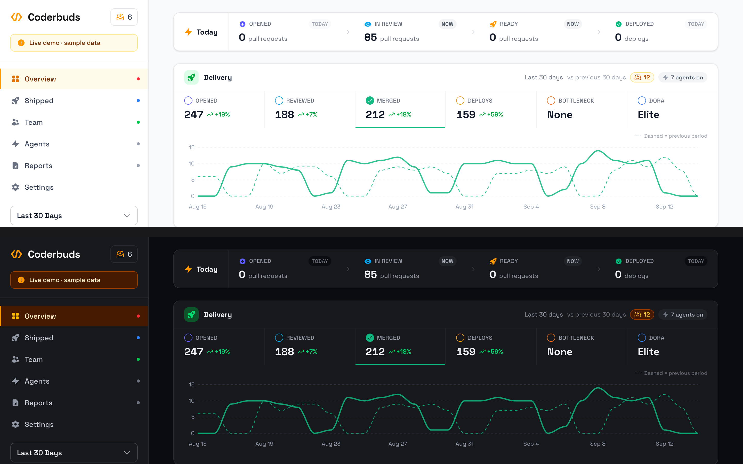
The interesting part isn't that it exists. It's that the obvious way to build it would have taken weeks, and we didn't have weeks.
#What we were starting from
Our marketing site and documentation have had dark styling for a long time — about 3,200 hand-written dark: utilities, following whatever your operating system is set to. The product itself had none. Not a few. Zero.
What it had instead was 5,844 hard-coded light colours — bg-white, text-gray-900, border-gray-200 — spread across 205 Vue components.
The textbook fix is to go through them: every bg-white becomes bg-white dark:bg-gray-900, every text-gray-900 gains a partner, 5,844 times. That's the highest-fidelity answer and we costed it honestly: several weeks, and a diff no human could meaningfully review. You'd be approving a wall of paired class names on trust.
So we went the other way.
#Repaint the palette, not the components
Tailwind v4 doesn't compile colours to literal values. bg-white compiles to this:
 1.bg-white {
 2  background-color: var(--color-white);
 3}
Which means the 356 places we'd written bg-white are already pointing at a single variable. Redefine that variable and all 356 change together:
 1.dark {
 2  --color-white: oklch(21% 0.008 265);
 3  --color-gray-50: oklch(15.5% 0.008 265);
 4  --color-gray-900: oklch(96.5% 0.005 265);
 5  /* ...and so on, through every ramp */
 6}
The accent colours are better than that. Tailwind's ramps are built so that 50 and 950 are a matched pair, and so are 100/900, 200/800, 300/700 and 400/600 — 500 is its own mirror. So for every hue we didn't hand-pick anything; we just reversed the ramp. A status badge written as bg-red-50 text-red-700 becomes bg-red-950 text-red-300 in dark mode, which is exactly the badge you'd have designed by hand.
The grey ramp we did tune, for two reasons a straight reversal gets wrong. bg-gray-50 is our page background and bg-white is the cards sitting on it, so in dark mode 50 has to land below white rather than above it. And text-gray-500 is the most common text colour in the whole product — 551 uses — which at a mirrored lightness would have sat right on the contrast floor. Both got lifted.
Total cost: one CSS block. The 205 components were not edited.
#What that approach costs
Being honest about the trade: with this technique, a surface cannot opt out. Every colour flips, whether or not flipping it makes sense.
And some of ours are dark deliberately. The nav bar. The left half of the sign-in screen. The floating guide panel. The "Sign in with GitHub" button. Those aren't light surfaces that should invert — they're dark surfaces that should stay put, and the inversion would have turned every one of them white.
The fix was to give them a palette of their own: a chrome-* ramp, an exact copy of Tailwind's zinc, deliberately left out of the inversion. Migrating those surfaces was a mechanical zinc-N → chrome-N, about twenty files.
text-white needed the same treatment, but only in some places. On a coloured button — bg-indigo-600 text-white — inverting is right: the background becomes a light indigo and the text goes dark, and the button stays a button. On a dark nav bar it's wrong, because the bar isn't going anywhere and the text would vanish into it. So on chrome surfaces text-white became text-chrome-50.
Amber caught us out in a third way. A hue's 500 is its own mirror pair, so bg-amber-500 is the same yellow in both themes — but the text-zinc-900 sitting on top of it would have gone near-white and taken the button's contrast with it.
#Two things that don't listen to CSS
Almost everything in a web app is painted by the stylesheet, so almost everything came along for free. Two things didn't.
The first is our trend chart. ApexCharts writes its gridline and axis-label colours directly into the SVG rather than reading a class, so those had to be told which theme is showing.
The second was worse, and we only caught it because someone hovered the chart:

ApexCharts renders its tooltip as a real DOM node styled by its own stylesheet. Left alone, the panel came from its light theme while the text inherited the page's near-white. White text on a white panel — and the numbers you hover a chart to read were precisely the part that disappeared. One config line fixed it, but nothing would have told us; there's no build error for invisible.
That's the general shape of the risk with this technique. It gets you most of the way in an afternoon, and what's left over is whatever paints outside CSS.
#The switch itself
Three options rather than two, because "System" is a real answer and not the absence of one — it keeps following your machine after you've chosen it, including when your machine flips at sunset.
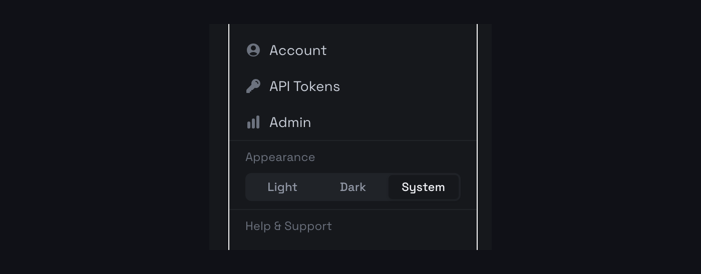
Your choice lives in localStorage and is applied by a small inline script in the page head, before the stylesheet loads. That ordering is the whole job: run it any later and a dark-mode visitor gets a white page for one frame first. It's a detail that's invisible when it's right and impossible to miss when it's wrong.
#What we haven't done
We should say this plainly, because you'll find it before we do.
The palette flip covers all 205 components mechanically, and we hand-checked the surfaces we could identify — the dark chrome, the text on amber buttons, the chart gridlines, the empty-state fills. We did not audit all 205 screens by eye. Overview, Activity and the sign-in flow were checked properly; the admin pages, reports and some of the drawers went dark without a human looking at them.
So there will be rough edges. If you hit one, tell us and we'll fix it — that's a far better use of the time than the three weeks the thorough version would have cost, spent before anyone could see whether they wanted dark mode at all.