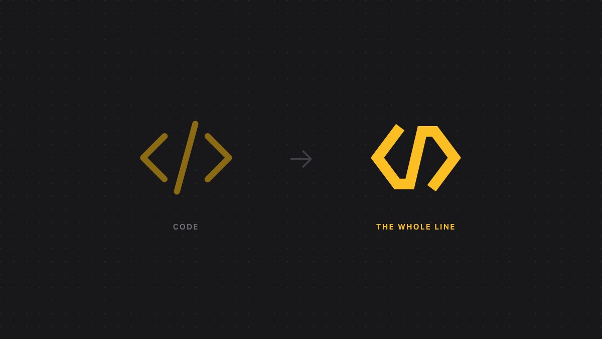
Our logo was </>. Two brackets and a slash — the universal shorthand for here is some code. When we picked it, that was the whole product: Coderbuds read your pull requests and told you something useful about them.
It isn't the whole product any more.
#What we grew into
Pull request review was a good place to start, because it's where the evidence lives. But every question a team actually brought us turned out to sit slightly outside it.
This was approved on Tuesday — is it live? Who deployed on Friday? We merged the fix; did the failure rate move? Are we shipping faster than last quarter, or just merging more?
None of those are code review questions. They're questions about the line that runs from an idea to a customer, and about whether anything is stuck on it.
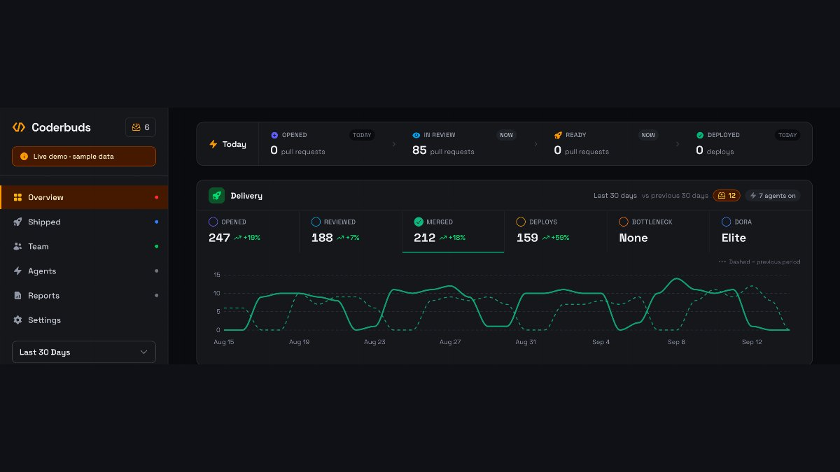
So we followed them. Coderbuds now watches the merge, the deploy and what happens afterwards. It runs in your console alongside the agents doing the work, and it reports back with numbers rather than vibes — lead time, deployment frequency, what shipped this week, what's been approved for four days and never went out.
We're a small team, which turns out to be the reason this happened rather than a caveat. There was no roadmap committee to persuade. Someone asked a question the product couldn't answer, and the honest options were to tell them it was out of scope or to go and build it. We kept picking the second one, and the shape of the product moved.
The logo didn't move with it. </> describes writing software. Our job is what happens to software after it's written.
#Why one continuous line
Here's the thing we kept noticing in customer data: nobody's problem is a stage. Every team we look at is competent at the individual steps. Code gets written. Reviews happen. Deploys go out. Metrics get collected.
The problems live in the seams. A pull request approved on Tuesday and deployed the following Monday. A merged change nobody can find in production. A metric that moved for reasons nobody traced back to a commit. Six good stages, loosely coupled, with work quietly pooling in the gaps between them.
Which is a fair description of the old mark, too: three separate strokes sitting near each other.
So we joined them. The left bracket's lower arm now runs into the foot of the slash. The head of the slash runs into the right bracket's upper arm. Same three shapes, same code silhouette, but the gaps are closed — one unbroken stroke that enters at the top left, travels the whole way through, and comes out at the bottom right.
Because it's a single path, it can be drawn in one gesture rather than assembled from parts. That felt like the right detail to get exact. A logo built from three pieces animates as three pieces arriving; this one is a line being drawn from one end to the other, which is the entire argument in about a second.
It plays once, on load, and it doesn't loop — a mark in permanent motion is one people train themselves to stop seeing.
#What stayed
Everything else, deliberately. Same amber, same zinc, same Space Grotesk wordmark. This isn't a rebrand and we weren't looking for one; the point was to stop the mark saying something narrower than the product does.
It's also heavier than it was. The old mark was drawn fine at large sizes and quietly gave up in a browser tab, which is one of the two places anyone actually sees it — the other being a Slack sidebar. The new one is drawn to survive 16 pixels first.
You can see it in the nav at the top of this page. Same </> we started with. We just closed the gaps.
Brand assets, colour values and usage guidelines are at coderbuds.com/brand.